Transforming Data into Art: How to Create a Gorgeous Pie Chart with ChatGPT
In today’s world of abundant information, being able to visually represent data is a necessary skill that helps us make sense of complex information and take meaningful actions. Pie charts, with their simple yet powerful representation, offer a unique way to visualize data proportions at a glance. With the advent of AI tools like ChatGPT, creating stunning pie charts from spreadsheet data has never been easier or more accessible. Watch the video below for a walkthrough of the process.
Follow these steps to transform your raw data into a beautiful, insightful pie chart.
Step 1: Drag and Drop Your Spreadsheet into ChatGPT
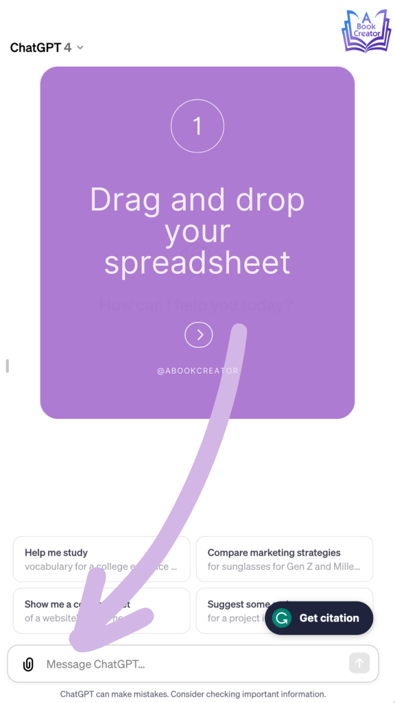
The journey begins with your data. Open ChatGPT and simply drag and drop your spreadsheet file into the chat window. This action starts the process, allowing ChatGPT to access the data you wish to visualize. Make sure you organize your spreadsheet with clear headings for each column, as this will streamline the next steps and ensure accuracy in your pie chart.
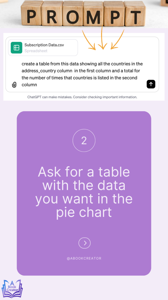
Step 2: Ask for a Table with the Data You Want in the Pie Chart
Once you upload your spreadsheet, the next step is to communicate with ChatGPT about the specific data you want to visualize. You can do this by asking ChatGPT to create a table from your spreadsheet, specifying the columns that apply to your pie chart. For instance, if your spreadsheet contains financial data, you might request a table that includes only the revenue by product category. This focused approach helps in isolating the essential data for your pie chart, ensuring clarity and precision in the visual representation.
Step 3: Pick a Color Palette for Your Pie Chart

Before moving on to the creation of the pie chart, it’s important to consider the aesthetic aspect. The color palette you choose plays a significant role in the readability and appeal of your chart. ChatGPT can work with a wide range of color specifications, so you have the freedom to pick a palette that aligns with your preferences or brand identity. Whether you opt for a monochromatic scheme or a vibrant array of contrasting colors, your choice will give your pie chart a personal touch that speaks to your audience.
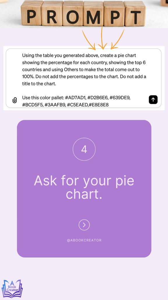
Step 4: Ask for Your Pie Chart
With your data specified and your color palette chosen, it’s time to bring your pie chart to life. Request ChatGPT to generate a pie chart based on the table and color preferences you’ve provided. ChatGPT’s advanced algorithms will process your request, creating a pie chart that not only accurately represents your data but also looks visually stunning. Once generated, you can download the pie chart for presentations, reports, or any other medium where your data needs to shine.
Step 5: Right Click on the Pie Chart and Save It to Your Computer
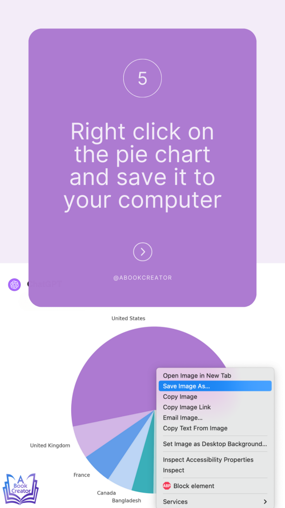
After ChatGPT presents you with your finished pie chart, the last step is to save this visual masterpiece to your computer. Right-click on the pie chart and select the option to save the image. Choose a destination on your computer where you can easily access it for future use. This step ensures that your beautiful, data-driven pie chart is not just a temporary view, but a permanent asset you can use and refer to whenever needed.
Conclusion:
The ability to turn spreadsheets into visually engaging pie charts with the help of AI like ChatGPT is a game-changer for data analysis and presentation. By following these simple steps—uploading your data, specifying your needs, selecting a color palette, generating your chart, and saving it—you can elevate your data storytelling to a new level. This process not only saves time but also ensures that you present your insights in a manner that is both beautiful and easy to understand. Embrace the power of AI and let ChatGPT help you transform your data into art.